


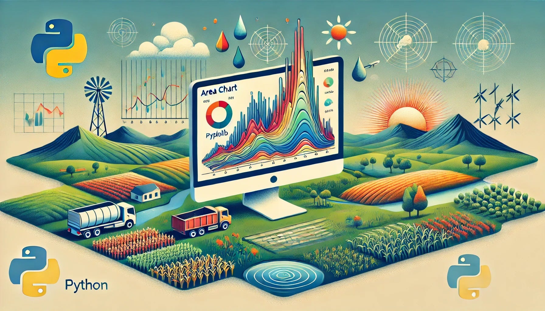
Area Chart in Python for Agricultural Science: Visualizing Farming Trends with Matplotlib and Seaborn

Article Outline
Introduction
Brief overview of the importance of visualizing agricultural data
Explanation of why area charts are effective for showing time-based or cumulative changes
Why Use an Area Chart in Agricultural Science
Highlighting trends in crop yields, water usage, and other farming metrics
Emphasizing cumulative or overlapping data for better insight
Comparing multiple categories (e.g., fertilizer types) within the same timeframe
Python Libraries and Tools for Area Charts
Overview of Matplotlib and Seaborn
Mention of Plotly as an interactive alternative
Discussion on how to choose the right plotting library based on project needs
End-to-End Python Examples with Simulated Datasets
Example 1: Crop Yield Over Time
Data simulation for different crops across seasons
Basic Matplotlib area chart illustrating single or multiple crop trends
Example 2: Water Usage Analysis
Daily or weekly simulated water consumption from various sources
Stacked area chart using Seaborn to show total and individual contributions
Example 3: Fertilizer Consumption
Simulated monthly data for multiple fertilizer types
Layered (overlapping) area chart to highlight different consumption patterns
Best Practices for Effective Area Charts
Selecting appropriate color palettes and transparency levels
Ensuring clear axis labels, legends, and annotations
Deciding between stacked vs. overlapping (layered) area plots
Common Pitfalls and How to Avoid Them
Overloading charts with too many categories or time points
Mislabeling axes or using inconsistent scales
Overlapping areas that obscure important trends due to poor color or alpha settings
Conclusion
Summary of how area charts help in understanding agricultural data trends
Encouragement to explore interactive visualizations and advanced customization
This article provides a comprehensive guide on creating area charts in Python for agricultural science, featuring end-to-end examples with simulated data to illustrate trends in crop yields, water usage, and fertilizer consumption.
Download end-to-end articles: https://nilimesh.gumroad.com/l/bkmdgt
Keep reading with a 7-day free trial
Subscribe to AI, Analytics & Data Science: Towards Analytics Specialist to keep reading this post and get 7 days of free access to the full post archives.