


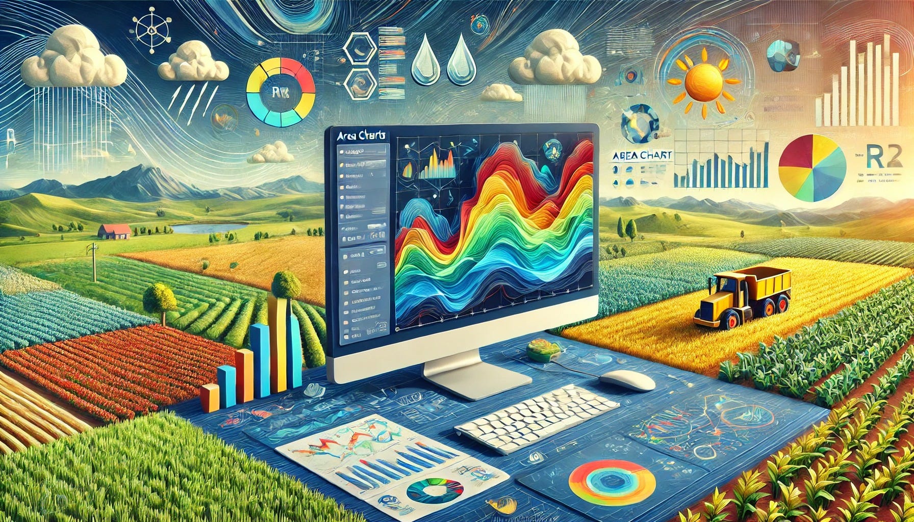
Creating and Visualising Area Charts in R for Agricultural Data Analysis

Article Outline:
Introduction
Importance of data visualization in agricultural research and decision-making
Overview of how area charts can reveal cumulative changes and trends in farming data
Why Use Area Charts in Agricultural Science
Highlighting changes in crop yield over time
Visualizing water usage or fertilizer consumption trends
Showing cumulative totals for livestock or production volumes
Key Considerations for Area Charts
Choosing appropriate variables for the x-axis (e.g., time, stages of plant growth)
Ensuring clear labeling and scales for better readability
Distinguishing between stacked and overlapping (layered) area charts
Getting Started with R for Area Charts
Essential packages for data manipulation and plotting (e.g., tidyverse, ggplot2)
Basic syntax and components of an area chart in ggplot2
End-to-End R Examples with Simulated Agricultural Data
Example 1: Crop Yield Over Seasons
Simulated dataset with multiple crops across different seasons
Steps: data creation, data manipulation (tidyr, dplyr), ggplot2 area chart
Example 2: Water Usage Trends
Simulated daily or weekly water usage data
Stacked area chart to show different sources of water or multiple farm sections
Example 3: Fertilizer Consumption
Simulated fertilizer usage data across months
Layered area chart to compare multiple fertilizer types
Tips for Effective Area Charts in R
Customizing colors, legends, and transparency
Using faceting to compare different regions or crop types
Adding annotations or reference lines to highlight key events
Common Pitfalls and How to Avoid Them
Data misinterpretation due to poor scale choices
Overlapping colors that obscure data
Cluttered charts with too many variables
Conclusion
Recap of how area charts can simplify complex agricultural data
Encouragement to apply area charts for quick and insightful visualizations in farming research
This article provides a comprehensive guide on creating area charts in R for agricultural science, illustrating how to visualize time-based trends in crop yields, water usage, and fertilizer consumption with practical examples.
library(repr)
options(repr.plot.width = 10, repr.plot.height = 6, repr.plot.res = 200)
options(warn = -1)
Download all end-to-end articles from https://nilimesh.gumroad.com/l/bkmdgt
Keep reading with a 7-day free trial
Subscribe to AI, Analytics & Data Science: Towards Analytics Specialist to keep reading this post and get 7 days of free access to the full post archives.